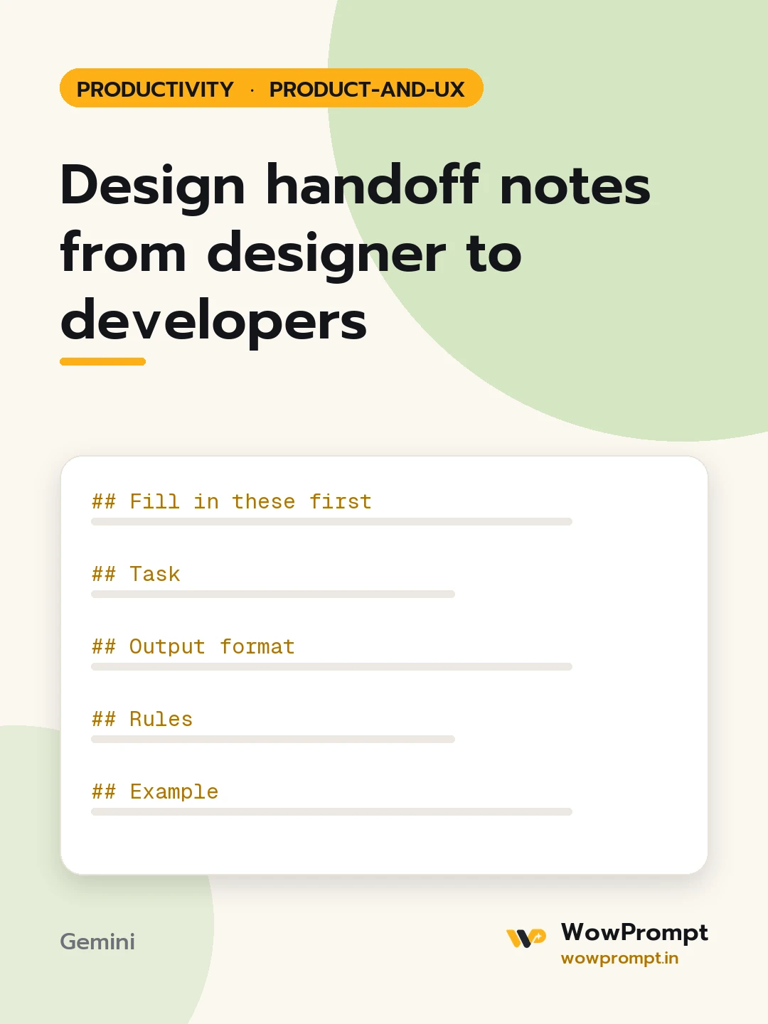
Fill in these first
- Feature and screens: [names of each screen or step]
- What each screen shows: [describe layout, components and content from the design file]
- Interactions: [what happens on tap, hover, submit, swipe]
- Design system in use: [name, or components built new for this feature]
- Platforms and breakpoints: [e.g. mobile web 360px up, tablet, desktop, Android app]
- Data the screens need: [fields, where they come from, maximum lengths]
Task
Write handoff notes a developer can build from without a meeting, and list every decision the design does not yet answer.
Output format
- Screen list with purpose of each in one line.
- Per screen: | Component | States (default, hover, focus, disabled, loading, error, empty) | Notes |
- Interaction rules: triggers, transitions, validation and what the user sees after each action.
- Responsive behaviour at each breakpoint, mobile first.
- Accessibility: focus order, labels for icons, contrast checks needed, touch target sizes.
- Edge cases: long names, no data, slow network, offline, very large numbers.
- Open questions for the designer, numbered.
Rules
- Do not invent colours, spacing values or copy; mark missing ones as [from design file].
- Every state listed has a defined look or is raised as an open question.
- Mobile behaviour is described first, wider screens after.
- Keep notes in short lines, not paragraphs.
Example
| Save button | Default, loading (spinner, label "Saving"), disabled until a field changes | Shows a toast "Changes saved" for 3 seconds |